Showing posts with label Illustrator. Show all posts

Monday, September 24, 2018

Traci Van Wagoner Making The Rainbow's Connection --- Plus a PRIZE!

Smart Note: Both Groups Stepping Back/Take Photos -- Pages 5-6

I owe so much to Traci for all the work she puts into Smart Dummies every year. Her support has help make Smart Dummies a wonderful event. This year she has really outdone herself with her post.

I have always adored Traci's work, but recently she's been doing some new work that I hadn't noticed before. I had a lot of fun looking at Traci's "Paint Play" illustrations and I started thinking about why I liked Traci's work so much. Part of the reason I love Traci's work is the lovely colors she uses in all her images. I asked Traci to write a post about her color choices this year.

Check the end of this post for a PRIZE!
----

Taming the Rainbow
By Traci Van Wagoner
www.tracivanwagoner.com


When Dani asked me to write about how I pick my colors, my mind sort went into panic mode, “I don’t know, I just slap color down.” It’s big question with a lot of years and experimentation behind it. I took a long time to tackle this subject, and I must thank Dani for her patience while I went back through time to figure out the answer.

Let me start at the beginning. Well, sorta. I started my illustration journey in traditional media during my first stint at college, where I experimented with pretty much every media. My favorite was oil and then acrylic because it was less messy and smelly — although I still to this day miss the smell of oil painting. My basic palette was titanium white, mars black, alizarin crimson, pthalo green, ultramarine blue, burnt sienna, burnt umber, cadmium red, yellow ochre, cadmium yellow, and a few others in and out.

When I moved to digital illustration after graduating from toy school (my second stint at college), I was gob-smacked with the endless possibilities in the color pickers in Painter and Photoshop, and I now had to worry about gamut, and printing, and how my art looked on different monitors. Eek! I started with finding color swatches online that matched the paint colors I knew and started from there. I settled on a color palette I liked, created my own paper textures and brushes, and that was that … for a long time.

After a while, what I was creating felt stale, overworked. Not fresh. Not fun. For many years I didn’t paint much. I created a lot of product illustrations for my clients at Imagine That! Design, so I had some creative outlet, but it was not fun, not really.

But life has a way of shaking things up. The product design work dried up (long story) which forced me to push my illustration work more. I got off my butt and got some more picture book jobs (for very little money I have to admit) which pushed me to explore and experiment a little. Then one day I saw Will Terry’s Santa snowboarding image which set off a switch in my imagination. I wanted to have as much fun as he seems to with his paintings, playing with color and light and unique perspectives. This set me off on a road of exploration still painting on the computer with Photoshop. My time creating was limited and confining, and painful, really.

Then a wonderful thing happened…

The iPad + Procreate = #PaintPlay

And shortly after, I discovered @colour_collective on twitter, a weekly challenge based on a different color each week.

Cue starburst of colors and wonderment.


My art side was set free. I had been so busy containing it with purple lines, and now I gave myself permission to just paint. I played with color, textures, the wide variety of brushes in Procreate. I pulled out old sketches from picture book dummies and from sketchbooks and painted many of those. I painted without having any goal or idea where I was going when I started. I could paint anywhere. I could paint anything. Paint play. And it has been a blast! You can see my #paintplay journey on Instagram: TraciVWCreations.

But the question remains: How do I pick my colors?

One color usually starts things off. Sometimes it’s dictated by the client, or the project, or by a licensed character. It can be a feeling or mood I want to create: happy-warm, sad-cool. Or the reddish colors of sunset vs. sunrise with pinkish tones. Or the time of year, the weather, a holiday, summer, winter, snowy, rainy.


The yellow raincoat was my start in my Singing in the Rain painting with primary colors complimenting.

A word can be the starting point, like a prompt word from a challenge: SCBWI Draw This Heat + colour_collective


The blue sample was my original since the warm of the girl and dog played so nicely off the cool blue, but then I decided to try the #colour_collective prompt #peach. I liked it that way better for telling the story of heat. I still debate. Do you have a favorite?

So you see, a lot of my #paintplay really is about slapping down color and seeing what happens.

One thing’s for sure, each week I play with a new color inspired by #colour_collective.

Once I have my main color, I pick additional colors.

I might pick complementary colors (opposites on the color wheel) or analogous (on the same side of the color wheel). Do I want to compliment that color with like colors on the same side of the color wheel to keep mood consistent and create a sense of harmony — warmth and happiness on one side or on the side cool colors creating a sense of melancholy, or a peaceful tranquil feeling. Or do I want to jar the reader with opposing colors?


Here are few hints:

• It’s more dynamic to use blue and orange (complementary colors) to play off of each other, but it can also be too much, especially if they are next to each other and at the same value. Then you get scintillation, which can drive your eyes crazy.

• Which brings me to value. You need to keep the value of colors in mind and how those play off each other.

• You get a more urgent feeling if you use primary colors vs. secondary colors.

I generally use the complementary color as splashes of color to draw the eye, to play off the main color and make it dance. This all gets into color theory, a big topic that is worth researching if you don’t know about it. Here’s a link with more information to get you started. http://www.pengadprinting.com/content/color-theory-part-i-primer-1

And since I LOVE value and light and shadows, after I have my color palette, I choose a light source, or multiple sources. After all, you don’t have color without light; and the color of the light will change the tone of your colors. Sun — yellow, orange. Or the moon — blue, purples or even greens. I love to play with value, shadows, reflective light, the contrast between warm and cool, how light plays off things, and how you can tell a story through a shadow.

I try to paint with light as much as color. I’m not always successful at that, but I’m having a blast trying. It’s still and always will be an evolving process. So, I paint on having fun trying to tame the rainbow.

Feel free to join in the fun of #paintplay with me on twitter (@TraciVanWagoner) and instagram (TVWCreations). I also share on Facebook , but you’ll get a lot of other stuff there too about my roof garden and my pets.

Also, keep an eye out for my latest book to be released October 1st, Ruth Asawa: A Sculpting Life by Joan Schoettler, illustrated by Traci Van Wagoner, Pelican Publishing


Happy painting!

-----

Follow Traci:

Website: https://www.tracivanwagoner.com/

Instagram: https://www.instagram.com/tracivwcreations/

Twitter: https://twitter.com/TraciVanWagoner

Facebook: https://www.facebook.com/TraciVanWagonerIllustrator/

PRIZE
@%@%@%@%@%

One person will win poster of Traci's art through her Redbubble store!*

*Prize shipping limited to the US.
a Rafflecopter giveaway

Thursday, September 20, 2018

Awesome Artist Angie Jones -- Plus A PRIZE!

I saw Angie's work on Instagram after a long time of not seeing her art. Angie has so much beautiful work on her Instagram page that's portfolio worthy, and going on her website I was blown away by all the beautiful things she's done! Angie has wonderful portfolios for all her painterly and vector children's illustration, design work and fine art. Because of her awesome portfolio I asked her to create a post about portfolio illustration.

Check the bottom of this post for a PRIZE!
-----

8 Steps to Your Best Portfolio

1. There is no getting around it. If you want a good portfolio you need a lot of art. You're not going to show all of it, but the more you make the better. It’s harder to make a stellar portfolio when you have only 10 or 20 pieces to choose from. The average portfolio is about 20 pieces. If you have only 20 pieces then you don’t have room to weed out the weaker art. Source from client work and self driven/assigned work.


2. Only show your best work. Look at all the work you have to show, and remove the weakest pieces. Your portfolio is only as strong as it’s weakest piece. Rinse repeat.

3. Limit how much work you show. Art directors want to quickly look through your work to get a good idea of your skill set. You can have multiple collections organized by common themes. They can be the medium used, the intended audience, a specific style, etc.


Examples 

Group 1: Raster Art


Group 2: Vector Art


Group 3: Black and White Art


4. Start with the best piece and end with the best piece. Always make a good first and last impression.


5. Look for a common trait for the work in your portfolio; develop that trait. It might be the way you render your noses, or the shape of a head. It could be color palettes and composition. Or perhaps it’s the story telling in the illustrations.

Eyes:


Texture:


6. Change your portfolio often. Change it by adding new personal or client work, show your work is evolving. Change it by reorganize your portfolio. A new order might make more sense. The change can be weeding out old outdated work. Change by making new samples that are like the type of art you want to be hired to make.


7. Set deadlines to refresh your portfolio. Change doesn’t happen without a little pressure. Self imposed deadlines will keep your book fresh.


8. When submitting to a specific client put together a portfolio tailored to them. Look at the type of art they’ve purchased in the past. Show the art that you think fits in with that art. Don’t have samples like the art they’ve purchased in the past? Make new art that does fit in.


The main takeaway? Keep making art! Show art! Try and make the best impression possible.

----

Follow Angie

Website: https://www.angiejones.com/

Twitter: https://twitter.com/AngieJonesDraws

Instagram: https://www.instagram.com/angiejonesdraws/

Facebook: https://www.facebook.com/Angie.Jones.Draws

Pinterest:  https://www.pinterest.ca/AngieJonesDraws/

PRIZE!

@%@%@%@%

Aijung Kim - 

Pick any 8 Cards: https://www.etsy.com/listing/169317524/pick-any-8-notecards-5-x-7-blank?ref=shop_home_active_5

This ships anywhere in the world!


a Rafflecopter giveaway

Tuesday, September 18, 2018

Epic Illustrator Rob Peters


Rob Peters has wonderfully expressive characters in his drawings. I've been following Rob for a while now on Instagram. I love his dedication to drawing every day. He creates such wonderful characters for all his work. There are so many pieces of his that I love and I don't think that I could pick one that I like best. If I did choose one, then it would probably be the Smart Dummies logo he created for this event. Of course I'm a bit biased on that one. 😂 I also love his illustration from "Little Red Riding Hood". So many people have done illustrations for this book, but I find that I just adore Rob Peter's illustration. He brings a fresh look to an old favorite!


-----

Dani: Could you share with us a couple important things you need before creating an image/book for a client?

Rob: I always like to start with the technical specs—page size, number of pages, etc. It’s good to get that out of the way first.


Then I want to know about the story from the author or editor—NOT necessarily the plot, I’ll get that later when I read the manuscript, but what the author feels and thinks about the story. What the tone of the story is—what it “feels” like. Much of my work is with self-published authors. Since self-publishing can be a big commitment, most of these authors are incredibly passionate about their books. Learning why they’re passionate about that specific story can help guide my art.

For example, I was contacted a few years ago by an author who wanted to know if I could draw a swan for their book. I responded with a small sketch of a swan. The author told me that my swan didn’t fit the book’s tone and would look elsewhere for an artist. I tried to explain that I didn’t know anything about the book or the intended tone, but it was too late to change their mind.


Dani: In an epic battle who would win: kittens or puppies?

Rob: I imagine it’ll play out like any superhero battle from the comics I grew up with—they’ll fight to a draw and then team up to stop their real enemy—squirrels.


Dani: What's one thing in the illustration process that takes you the most time to do?
Rob: I think the coloring stage takes the longest because there’s the most variables there. A good drawing with a good composition can become a mess if the colors aren’t right.


Dani: Out of all the Daily Drawings you've done which series is your favorite?

Rob: For those that don’t know, I post a Daily Drawing online every weekday morning. These a little line art pieces relating to a monthly theme.

It’s hard to pick a favorite but I think Elephants and Monkeys are somewhere at the top of my list.


Dani: Your artwork is very expressive. Do you have any tips for adding emotion to art?

Rob: Use the whole body when showing emotion, not just the face. A happy character might stand a little straighter and have a broader stance while a depressed character might curl up and draw in on themselves.

Smart Dummies Logo Contest Winning Entry!

Dani: What are you working on now?

Rob: I just finished up illustrating an ABC animal book “Finding Your Best Furever Friend” which the publisher, Ascend Books, plans to have out by Christmas. Beyond that, I’ve been working on a few ideas for a dummy book of my own which I’ll get started on very soon...

----

Follow Rob:

Website: http://www.rob-peters.com/

Twitter: https://twitter.com/RobPetersArt

Instagram: https://www.instagram.com/RobPetersArt/

Facebook: https://www.facebook.com/RobPetersIllustration/


Monday, September 17, 2018

Limited Palette—Unlimited Storytelling Potential by Sarah LuAnn Perkins -- Plus a PRIZE!

Sarah Luann Perkins is one of the wonderful people who have devoted their time to help with Smart Dummies. She has given lots of great ideas, so some of the changes I've made over the past few years are thanks to her! I absolutely love Sarah's work. Recently she's been doing gorgeous images but by using an extremely limited palette. I thought that she might be able to give us all a little bit of wisdom from her experiences!

----


Limited Palette—Unlimited Storytelling Potential


So often when we think of products, books, and art for kids, we think of a fully saturated rainbow of colors. And there is nothing wrong with that—unless you’re using it as a default. Is that bright, “kid-friendly” color scheme really serving your story? Maybe it is, but maybe your story needs something different.

Wait a second, you say. We’re just making a dummy right now. A dummy is sketches, not fully colored art.

Well… you have a point. But color is an amazing tool for visual storytelling, and thinking about it early in the game—even if it’s just to write little notes to yourself on your sketches—can only improve your ability to communicate your story.

To see great examples of color in storytelling, I automatically think of film—which isn’t to say that there aren’t many examples of great color in picture books, but inspiration across mediums is always a good thing.

I love this short video which shows the basics of how filmmakers use colors to give different moods to different types of films/scenes.


To me, color in picture books is like a soundtrack for a film. We can’t use real music or sound to emphasize a moment or convey a mood—color is the tool we have available for that job.

But color is a tricky thing. It can mean different things to different people. In one story, red might represent love, while in another it might represent anger. Another artist may just use red to bring your attention to what is important in the illustration. None of them are wrong. But choosing color with intention is the key—if you are deliberate in how you use your color, viewers of your art will respond.

There aren’t any rules about how you have to use color to tell your story, but here are a list of questions you can think through to make sure to use color in your storytelling to its greatest potential:


Did I choose this color by default (i.e. getting out your “grass green” crayon to color the grass) or because it makes sense for my story?

Do I need a full range of colors for my story, or can I choose just a couple to get my ideas across?

What is the overall theme of my story? What colors would emphasize that theme? Are there any that would contradict or dilute that theme?

What is my conflict—are there two sides that could each have a color? Is it an inner conflict that could be reflected in surrounding colors?

Are there different places, important groups of things or characters, times or day, or seasons which could be emphasized through specific colors?

What are the important transitions in my story—location, mood, character? Could I use color to emphasize those transitions?

Could color be used to heighten my climax in any way?

Can I use color to direct the eye to the important parts of the illustration? Where do I want readers to look first?

What colors could I leave out to better emphasize the overall mood and theme of my story?

And, last but not least:

Do I like the colors I’ve chosen?

I hope that having these questions in your mind as you create your dummy will help you use color to your advantage.

What picture books do you think use color particularly well in their storytelling? Is that something you’ve ever paid attention to before? Tell us in the comments!

Happy sketching!

Sarah LuAnn

---

Follow Sarah:

Websitehttp://www.sarahluann.com/

Twitter: https://twitter.com/SarahLuAnnArt

Instagram: https://www.instagram.com/sarahluannart/

Shop: https://www.inprnt.com/gallery/sarahluannperkins/

-----


PRIZE!
@%@%@%@%@%

One lucky winner will win an 8x10 print from Sarah!*


*Shipping on this prize is limited to the US.

a Rafflecopter giveaway

Tuesday, September 11, 2018

Make a Splash in Illustration with Mark Mitchell -- Plus a PRIZE

Mark Michell has been posting for the Smart Dummies challenge for several years now. Mark always creates such wonderful posts for Smart Dummies. Not only that, but his newsletter is has been very inspirational for me. I have learned so much from Mark's newsletters over the years. One thing we haven't talked about is his course and his Group Guest Critiques, both of which are amazing but you don't have to take my word for it! Here is the link to the course: https://daniduck--marksandsplasheslearning.thrivecart.com/make-your-marks-and-splashes-copy-2/ (If you use this link to sign up it helps out Smart Dummies and me personally!)

Don't forget to check for a PRIZE at the bottom of this post!

- - -

Dani: First things first: How did you get started with your website and courses for your “How to be a Children's Book Illustrator” website?

Mark: The original course in late 2009 or 2010 was a set of homemade web pages.
It was based on classes I've been teaching for years at the Art School at Laguna Gloria in Austin, Texas. I wrote out the lessons, trying to get words around the ideas.
They were on the site in PDF format. Later I added little videos for a 'multi-media' experience.


Dani: What are a few things that you've learned from the Group Guest Critiques?

Mark: Guest Group Critiques are a separate offering from the online course, which is called Make Your Marks and Splashes.

In the original Marks & Splashes course, we had a live group critique component. But I was doing all the critiquing. After a few years, I started bringing in other illustrators to be guest teachers so we could hear new ideas and different points of view.


Because of the expense involved in that, we've since pulled Guest Group Critiques away from the course and made it into its' own separate subscription product.

It's a way for students to continue with live sessions after they've 'graduated' from the Marks & Splashes main course. But we also let non-alums, non-students subscribe, too.

To answer your question, what I feel I've personally learned from these guest sessions is what a vast variety of art styles and approaches exist in children's publishing today. And how practically anything goes, as long as you can make it 'work' through fun storytelling and the classic design principles.


Dani: How does “Group Guest Critiques” help illustrators with their craft?


Mark: First, it provides challenging Illustration prompts every month from guest instructors – who are published illustrators or author-illustrators. (Sometimes they're agents, art reps, or art directors.) Their prompts nudge you to create new work or make that portfolio piece even better. Plus they're a good, consistent practice opportunity for you, as are similarly repeating programs like Illustration Friday or Inktober.

Second, the critique, if your piece is selected to be examined in the live session by a professional. Plus the reactions and feedback from the community group via the lively text chat each session. You have lots of eyes on your piece when it's up.

Third, tips and tricks. Every critique has an instructional component. Guest critiquers teach a lesson or give a little talk before they go into the critiques when they pick about 10 pieces to discuss from the submissions.

All of this prepares you for that big SCBWI conference where you're bringing work, or that all-important postcard or PB dummy mailing.


Dani: What's new for the Make Your Marks and Splashes course in 2018?


Mark: It's graduated up to a WordPress membership site with everything in one easy place. All the original lessons videos are there. And new videos on best 2018 practices for marketing and promoting your art and resources available.

The original Drawing (Marks) and Painting (Splashes) modules have added new videos – workshop, interview and/or critique videos with illustrators and author-illustrators.

The Find Your Fit module, about promoting yourself to agents and publishers has added videos on marketing best practices for 2018), resources available for artists and writers and hours of workshop and interview videos with six agents, five art directors and four publishers and self-publishers.

A new module, Julie's Story Town focuses on picture books. It's about building your dummy and secrets to incorporating story craft into your illustrations. This module has videos (ranging up to two hours long) with 10 author-illustrators.

The new course also features live group homework reviews – monthly events starting this month [Septmeber] – to make sure that everyone who wants the feedback is on track with her lessons. We're introducing a five-month semester cycle on these.

They're not the elaborate critiques of the old days, because that's what the
Guest Group Critiques and Workshop Series like the Drawing Children series we did and the workshops we're doing now with the Girllustrators are for.

Instead, the homework reviews are to check off on your submitted homework, so you'll know when you've 'got' the idea and skillset of each lesson and exercise – or you don't and it's time to try again.


Dani: What are some of the things that illustrators will learn in “Make Your Marks and Splashes?'


Mark: They'll learn a natural approach to illustration that removes needless struggle and guesswork from drawing, composition and color planning. This approach also shows you how to make the most of what you already have working for you in your art.


They'll learn to become comfortable and confident with traditional watercolor painting.

Confidence results in more beautiful pictures. With the basics handled (drawing, composition, and color) you can enjoy the process and give the lion's share of your attention to where your greatest value as a children's book illustrator lies – your characters and storytelling.


Dani: How is “Make Your Marks and Splashes” different from other courses out there?


Mark: The ones I know of out there are all good, provide plenty of value for the investment and are all a little different from each other.

What distinguishes this course, I think is its emphasis on the 'natural method' based on the ideas of Kimon Nicolaides, Betty Edwards, and others.

The confidence this method gives you frees up your creativity and uniqueness, which makes the method ideal for children's book illustration.

Also the many classroom-tested lessons on painting in traditional watercolor, which can help you with any kind of painting.

And the sheer number of original videos. The course holds more than 100 videos immersing you in the world of making art for children's publishing, including sessions with 50 illustrators and author-illustrators who work in a variety of media (including digital) and styles.

Years in the making and doing, Marks and Splashes is an old-fashioned art class at heart – except the pictures you create are children's story scenes.

My students have ranged from beginning artists to MFAs, living in just about any country in the world you can imagine. Many have since had their work published.

If you'd like to receive email notifications about this and other Marks & Splashes offerings and new blog postings, sign up here.


* * * * * * * *


Mark is the author-illustrator of "Raising La Belle: The Story of the La Salle Shipwreck", which won a Spur Award from the Western Writers of America for best juvenile nonfiction book. He has also illustrated and written other books and for many children's magazines.


Mark G. Mitchell

-----

Follow Mark:

To join the course: https://daniduck--marksandsplasheslearning.thrivecart.com/make-your-marks-and-splashes-copy-2/ (If you use this link it helps out me and Smart Dummies!)

Blog: http://HowToBeAChildrensBookIllustrator.com

Twitter: https://twitter.com/MarkGMitchell


PRIZE

@%@%@%@%@%

Marla LesageA Portfolio Critique OR Dummy Critique!

You must finish your dummy to win this prize!

a Rafflecopter giveaway

Monday, September 10, 2018

The Miraculous Mira Reisberg - - Plus a PRIZE!

Smart Note: Adj. Stepping Back  -- Page 5 Tomorrow: Reg. Emotions and Poses -- Pages 12-13

I love that I've been friends with Mira for a few years now. She has helped out with Smart Dummies since the beginning. Her help with this event has encouraged me to work harder year after year to make Smart Dummies an event that helps other illustrators. I see all the work Mira does in helping other people with their work through her free webinars and everything she does.


I've seen many webinars that Mira and the Children's Book Academy has given over the years. I've learned a lot from every one of her webinars. These are the types of courses to take. Learn from people who honestly want to help people and will give out free information. Unfortunately I hadn't had the opportunity to take her classes until just recently. So far it is absolutely wonderful! I'm having a lot of fun. I promise to do a full write up on the course once it's all done. One thing I will say now is that her illustration course fits in perfectly with Smart Dummies. Sign up for the mailing list so you can catch the next illustration course!

Check the bottom of this post for a PRIZE!
-----

Dani: What are some of the things Illustrators and writers should look for in an online course?

Mira: First of all, thank you Dani for inviting me to be a part of your wonderful challenge. As you know, there are now many online courses available, which can make it a bit of a challenge in terms of which course to choose. The first thing you want to look at is how qualified the person is running the course or school in terms of both education and how many books they’ve published as well as the quality of testimonials speaking to both the instructors teaching style and the content of the materials that they share. You want to find out how substantive the course is - is it described as 10 weeks but it’s only one lesson a week spread out over time or how many lessons will you actually be receiving? Are you someone who needs the support of an interactive environment where you are given guidance and lots of interaction or do you prefer a go it alone approach? If it’s the former, choose a highly interactive course but if you prefer to go it alone, go for an instant access course. Besides the lessons and the teaching, what other resources will the course be providing to help illustrators and writers meet their goals and dreams? Finally, does the teacher have any kind of track-record of helping people do great work and get published? I think these are helpful questions to consider when looking for an online writing or illustrating course.


Dani: How should one prepare when taking a class on the computer? 

Mira: There’s not a lot of things you really need to do to prepare for an online course other than make sure you have decent internet or can have access to somewhere with good internet like a library or café. With an interactive illustration course that has a beginning and end date for interaction, you need to have a scanner or access to one, or be pretty good at taking digital photographs of your work so that you can share it for feedback. Apart from carving out time to take advantage of the course and have working tech – a reliable computer, Internet, scanner etc. you don't really need that much.


Dani: When working online what's something that people tend to forget?

Mira: People often forget about the importance and vibrancy of community in online courses. You can form or take part in really robust groups where you make friends with people all over the world, join critique groups that go on indefinitely, and support each other in realizing dreams in a myriad of ways including getting marketing support from your peers after you get published. Having taught both in universities and online, I was very surprised to find this. The other thing I realized was that I could bring infinitely more resources online than I ever could teaching in person. That was a big surprise. Being a bit of a resource queen, I love this.


Dani: How does the Children's Book Academy help writers and illustrators hone their craft?

Mira: Pretty much all of the above plus, because of my intensive educational background, and my PhD work in developing a pedagogy of pleasure through children’s literature and art, I like to think that we are pretty expert in teaching in a fun and in-depth way. I love co-teaching with other experts, often from within the publishing world and am proud to say our former students have won just about every North American award and published around 230 books. We also provide lots of bonuses and exceptional resources helping you directly connect with editors, agents, and art directors through critiquing webinars and skip the line submission opportunities. For me, this is not just a business, it’s my life’s work - helping others create wonderful meaningful or fun-filled kid’s books, and getting them published.


Dani: If you could only give one book to a new author/illustrator what would it be?

Mira: Voices In The Park by Anthony Browne is one of the most brilliant children’s books ever published in terms of learning voice and how to layer in social justice themes like class and gender without being heavy-handed. It has equally extraordinary multi-layered illustrations that reference art history. Here’s a review of it if you want to find out more. And while the review doesn’t talk about the super smart way that the book subverts gender roles and addresses class it does give a glimpse of why it’s so brilliant. I also think younger readers will appreciate it too because of the language and art, even if they don't get all the layers. https://www.publishersweekly.com/978-0-7894-2522-5

Another favorite is I See The Rhythm by Toyomi Igus and Michelle Woods. This is another perfect mix of art and words with a multi-layered approach to African American history and music that is relevant for all kids. Here’s a review for that, which I wish mentioned the relevance of African-American music on the history of North American music in general, but still gives a glimpse of why it’s such a great book https://blogs.iwu.edu/edu320spring14clrb/2014/04/03/i-see-the-rhythm/

Finally, I have to give a shout out to Mac Barnett who is such a clever wordsmith and whose books always make me laugh.

I hope this interview has something helpful for someone. Thank you Dani and thank you everyone here for reading this.


Mira’s bio

Over the past 30 years, Dr. Mira Reisberg has worn just about every hat in the children’s book industry including award-winning illustrator, author, and children’s literary agent. Mira holds a PhD in Education and Cultural Studies with a focus on Children’s Literature. She taught university level children’s book courses before starting her own international online school – the Children’s Book Academy http://bit.ly/CreateKidsBooks Mira’s students have published or contracted over 230 books and won just about every North American children’s book award. Her first edited and art-directed acquisitions at Clear Fork/Spork will be available at the end of 2018 and early 2019. She feels very grateful to help make the world a better and more joyful place through children's books. If you join her newsletter tribe, she will send you wonderful goodies bit.ly/CBA-Gift
-----

Follow Mira:


-----

PRIZE
@%@%@%@%@%

Mira is offering a 5 Ways to Make a Dummy Course!


a Rafflecopter giveaway

Thursday, September 6, 2018

The Lovable Blythe Russo Talks about Creating Lovable Characters

Blythe Russo is one of the wonderful Moderators for the #kidlitart chat on Twitter.  She creates absolutely adorable characters. I mean, I want her horses in real life because they look that amazing. I mean I have no room for a horse, but for her horses I'd find space! "One More Wheel" by Colleen AF Venable and illustrated by Blythe Russo comes out to book shelves next year!


The #kidlitart chat runs Thursday nights 6pm PST, 9pm EST on Twitter. It's a wonderful chat where illustrators talk about different topics in the kidlit industry.

-----


So, Dani asked if I would write a blog post about “creating loveable characters” and as I sat down to write, I realized I had no idea what to say that hasn’t been said a bajillion times before.

Design-wise, there are SO MANY posts and classes and tutorials that can teach you how to make cool and cute and interesting characters. Like, a vast amount, you guys.


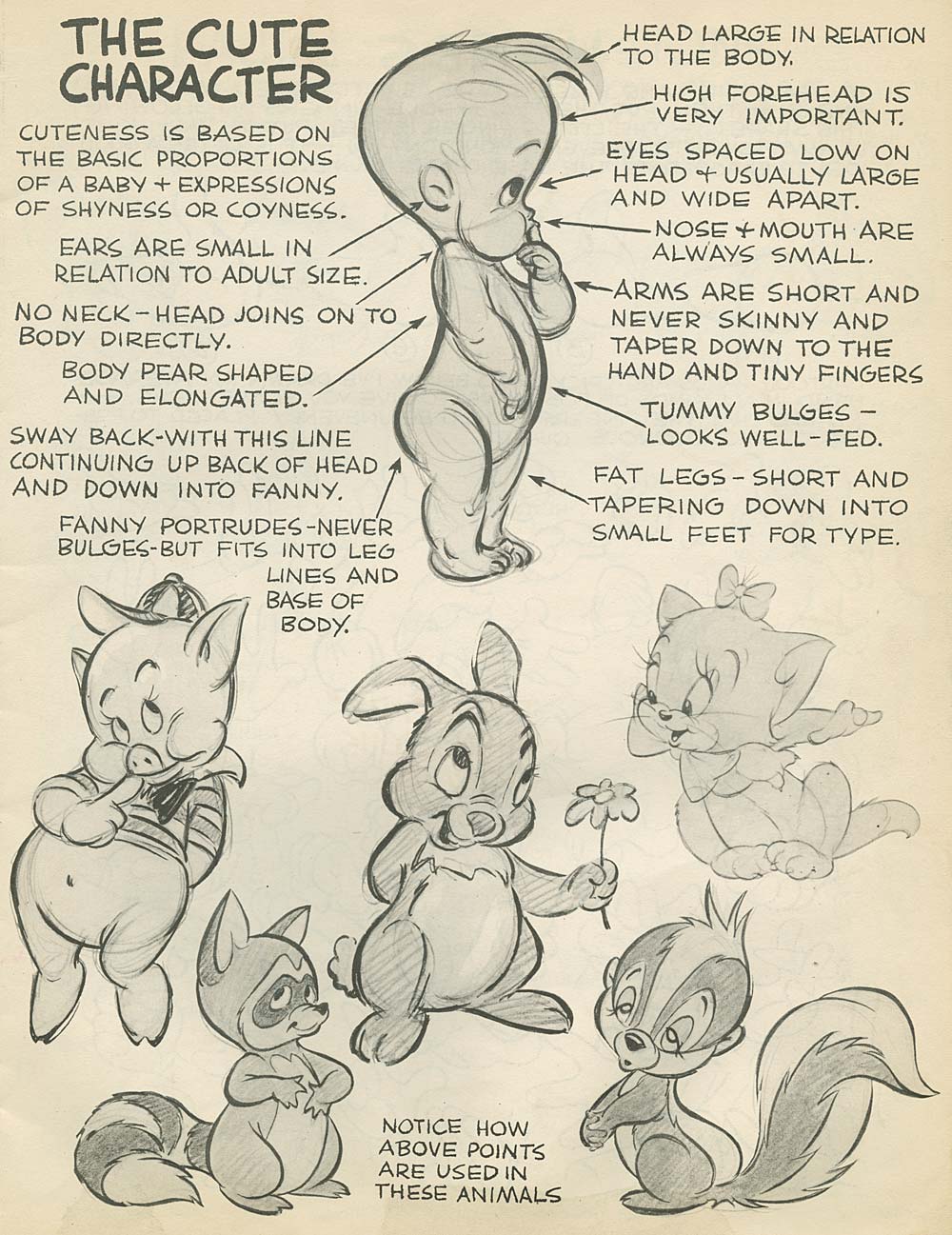
I mean, creating cute and loveable characters is based on a formula. Preston Blair attributed the drawing of “cute characters” to mimicking the proportions of a baby.


Loveable = Huggable. It’s all about the round shapes and curves.


Easy enough, right? But then I questioned whether a character being loveable is even the most important trait for them to have?


Yes, a character should be loveable. HOWEVER, shouldn’t it be more important for the character to be RELATABLE?


I think relatable characters, whether they are troublemakers like David (David Shannon), or precocious like Olivia (Ian Falconer), or misunderstood like Amelia Bedelia (Peggy and Herman Parish), are loveable BECAUSE OF their flaws. Kids can see themselves in the characters because they aren’t always loveable.

They make mistakes.


And they also learn from those mistakes.

Just like the children they are written for.


So I think the best way to “create loveable characters” is to give them flaws and let them make the wrong choices, but also let them learn to fix them.


Also, make your character SPECIFIC. Give them a personality and wardrobe and facial features and physical gestures that are all their own.


Band-aids on the knees, missing socks, slouchy posture, grass-stained pants, freckles, etc.


We teach children that they’re special and one-of-a-kind, why should we treat our characters differently?


Make them imperfect.


But love them anyway.


Because if YOU love your character, if YOU relate to them, others will too.

-----
Kidlitart Chat on Twitter: https://twitter.com/kidlitart and their website: http://kidlitart.blogspot.com/ Use #kidlitart for chat!


Monday, September 3, 2018

Unique Character Designer Kristin Wauson! -- Plus A PRIZE!

Smart Note: Reg. Start Your Characters - Pages 8-9

I think that Kristin is one of my biggest helpers on Instagram because she often uses the #smartdummieschallenge tag on her images. This tag lets me know that she's got new work that she wants me to see and share. It makes things so much easier when I'm looking for new artwork to show on my Smart Dummies Challenge Instagram!

Kristin's work is bright, beautiful and has a lot of heart! She has done so much beautiful work in the last year on Instagram (which is about as long as I've been on Instagram). Her characters are just so wonderful that I asked her to write a post about creating characters!

Check the bottom of this post for a PRIZE!
-----

Thank you again, so much, for inviting me to write a post! -Kristin

How to Design a Unique Character, Start to Finish 

What’s so hard about designing characters? For me, it’s the temptation to settle on the first one I draw that looks halfway decent. Let’s say you need to draw a crocodile, and you haven’t drawn many crocodiles. You sit down with your sketchbook and hopefully some reference and work at it until you have something that resembles ... a crocodile.

You’re feeling proud of your effort so you show your masterpiece to your kids just to make sure you nailed it, and they say, “an alligator!” Close enough. Five minutes later you’ve named him Jimmy and slapped him into your picture book dummy.

So, what’s wrong with that? While you might have drawn a perfectly good crocodile, he probably looks a lot like your reference (ahem, boring) or even worse, like the most generic crocodile you can muster from memory because our brains are lazy. Have you ever asked your brain for a masterpiece and gotten stuff like this?


These are symbols. Our brains use them to help us process complex thoughts, and while they communicate meaning and keep us sane in life, they do not make for interesting drawings. You’ve already worked hard on your story and you going to work even harder on your dummy. Your dummy deserves unique characters!

How do you get one of those? Hard work my friends. Your brain may be lazy, but because you are here doing Smart Dummies, I know that you are not. This post took me a long time to put together because I actually designed a character from scratch. Don’t you hate it when people suggest that you do things they aren’t willing to do themselves? And now I am going take you through the entire process of how I designed a crocodile character.

Chicken? Egg?
What comes first, words or pictures? There’s no right answer. Many professional character designers start with words, probably because they work from written design briefs. If you have an idea that you prefer starting with words, try starting with pictures. Or vice versa. The results may surprise you.

When the character arrives, the story will appear.
Characters have a unique ability to drive stories. I am always surprised by how many story ideas occur to me as I am sketching a character. The same is true for writing about your characters. Once you create a fully formed character with a personality, flaws, fears and a pet chicken, you will automatically start thinking about how that character would respond to different situations.

The creative process isn’t always straight forward.
I wanted to present you with a clear start to finish process you can follow to design your own characters, but real life is messy. And instead of pretending I had planned it this way all along, I decided to let you see how it evolved.

I began by using words, but once I started drawing, inspiration struck. Suddenly I had a new story idea (which I am not ready to share yet as I am writing this post) and I decided to abandon the original idea. That’s the benefit of staying open and flexible during the early stages of a project. The process can sometimes lead you somewhere unexpected and letting this happen organically can result in some great things.

Step 1. Get to Know Your Character

The character prompt I started with was this:

Design a crocodile who is an enthusiastic beach lifeguard, but everyone is afraid him and nobody wants to be rescued.

Questions are a great way to get to know your character. I started with a list like this one:

What is my name?
What do I look like?
How old am I?
Where do I live?
When (time period) do I live?
What is my job or role in life?
What is my greatest joy in life?
What do I like to eat?
Do I have a pet?
What do I do for fun?
What do I dislike?
What is my personality like?
What kind of clothes do I wear (if any)?
What am I afraid of?
What is something that I need?
What is my lifelong dream?
Who is my nemesis?
Who is my best friend?

Step 2. Research

I researched and drew some real crocodiles in my sketchbook. Even if you are drawing a very stylized character, understanding real life anatomy will make your characters more believable.

I also researched beach lifeguards, and because I initially wanted him to be a muscle head, I looked up pictures of muscular men. (This was actually terrifying and might be the real reason I ended up taking another route!)

The last thing I did was look at character designs by different artists and note things that I liked or didn’t like. This can help get ideas flowing and helps me visualize possibilities for features and shapes.

Step 3. Character Construction

Next I drew a whole page of bodies focusing on a simple overall silhouettes first (details come later). I built the bodies using basic shapes to represent the legs, torso and head and I tried to use a variety of shapes in different sizes and proportions. The more iterations you can do, the better.


Basic Shapes: Shape possibilities are endless, but you can start with these:
• circles are soft, cute, nurturing, non-threatening
• squares are solid, firm, grounded and stable
• triangles are sharp, edgy, dangerous, aggressive and unstable/unpredictable if balanced on one point

Sizes: tiny, small, medium, large, huge
Variety is the key. One size does not fit all. For example draw a character with a small head, a huge body and tiny legs.
Proportions: experiment with the facial proportions and placement of features as well as body proportions.

4. Define, Push, Pull, Add Details


Next I added a new layer on top of my silhouettes (you can do this with tracing paper too!) and defined the features more and added details


Once I finished those, I chose my favorite croc and copy pasted him several times onto a blank canvas. Again, this can be done on regular paper, the setup just might take longer. I added another layer and drew over the top of him with the goal of turning him into six new and completely different characters. I like using the warp tool (benefit of working digitally!) for this stage because you can literally squash and stretch the character until you find something interesting.


This was when I realized my favorite character design was not right for my lifeguard story, but I decided to render him anyway and as I worked, he gave me an idea for a new story which I can hopefully flesh out during Smart Dummies!

5. Rinse and Repeat

Until your book is published nothing is ever “final.” I still need to get to know this guy, so I will go back to asking myself questions about him, and the answers may inspire some adjustments to the final design.


This process is a little like the song that never ends. You can repeat it indefinitely until you either find something you like, or you go insane. We wouldn’t have it any other way.

That’s it! I hope you have enjoyed following along as I designed this crocodile character. If you have any favorite character design tips or tricks, please share them in the comments.

----

Follow Kristin

Website: http://madmomstudio.com/

Instagram: https://www.instagram.com/kristinwauson/

Twitter: https://twitter.com/kristinwauson

Facebook: https://www.facebook.com/madmomstudio/

Dribble: https://dribbble.com/kristinwauson


PRIZE
@%@%@%@%@%

Kristin will give 1 lucky person a critique on 2-3 of their illustrations either in their dummy or portfolio. 

You must win Smart Dummies to get this prize!


a Rafflecopter giveaway